
Independent end-to-end user research
This MVP documents why research matters,
the process of conducting UX research studies
& reporting the results
This MVP documents why research matters,
the process of conducting UX research studies
& reporting the results
This MVP documents why research matters,
the process of conducting UX research studies & reporting the results
Role
Research synthesis
Task & user flows
Visual design
Research synthesis
Task & user flows
Visual design
Research synthesis
Task & user flows
Visual design
Research Methods
US-based Participants recruitment
Semi-structured interviews
Survey
Deliverables
User research plan
Wireframes
Usability testing videos
Prototypes
Data & insights report
User research plan
Wireframes
Usability testing videos
Prototypes
Data & insights report
User research plan
Wireframes
Usability testing videos
Prototypes
Data & insights report
Customer problems & Project overview
How to correctly approach a design problem? — design with users & data in mind
This product curates travelling tours from different companies in one place for the user, and lets them join with ease. Information-finding is made easy for users, as they see which Tour company offers what, and the perks available.
The product will solve the problem of users having to hop around Google searches and visiting multiple website before seeing tour deals that match their requirements.
Users have expectations, and don't enjoy not having so much back & forth with these tour companies before realising they should move on. This app also solves this pain point.
What I did
What I did
Problem definition and design scoping to 1 focus group & 1 task flow
Created a research plan
Wrote research and survey questions
Participant recruitment
Used affinity mapping to analyze user data
Ran a design sprint
Conducted Usability testing sessions
Discovery: research & interview notes
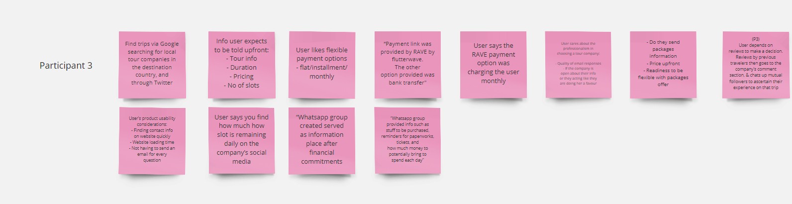
✅To scope my design problem, I defined my user group: Adult vacationers, & the core task flow: Find and Book trip
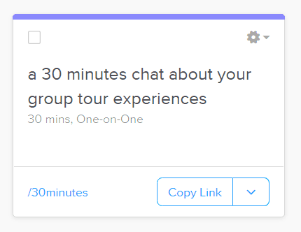
✅Using Calendly, I had volunteers who matched my screener questions schedule 30 minutes call time. In these user interviews, I learnt about their group trip experiences, and took notes of their behaviour, & needs through prepared research questions.
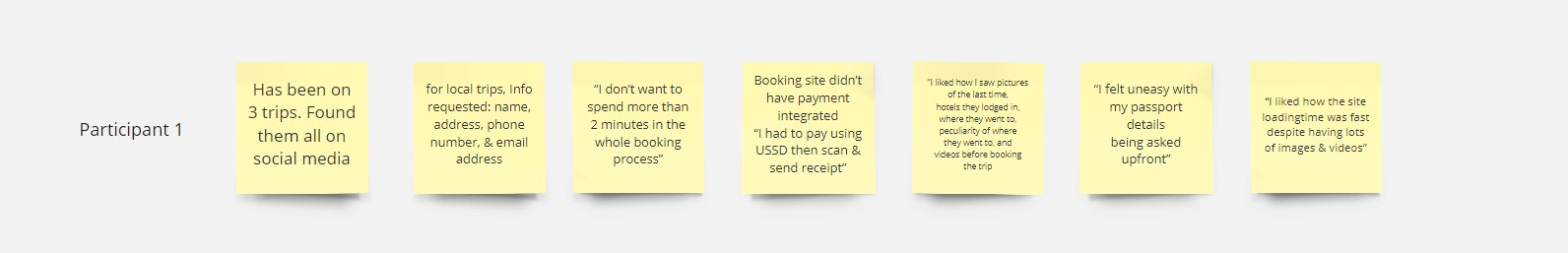
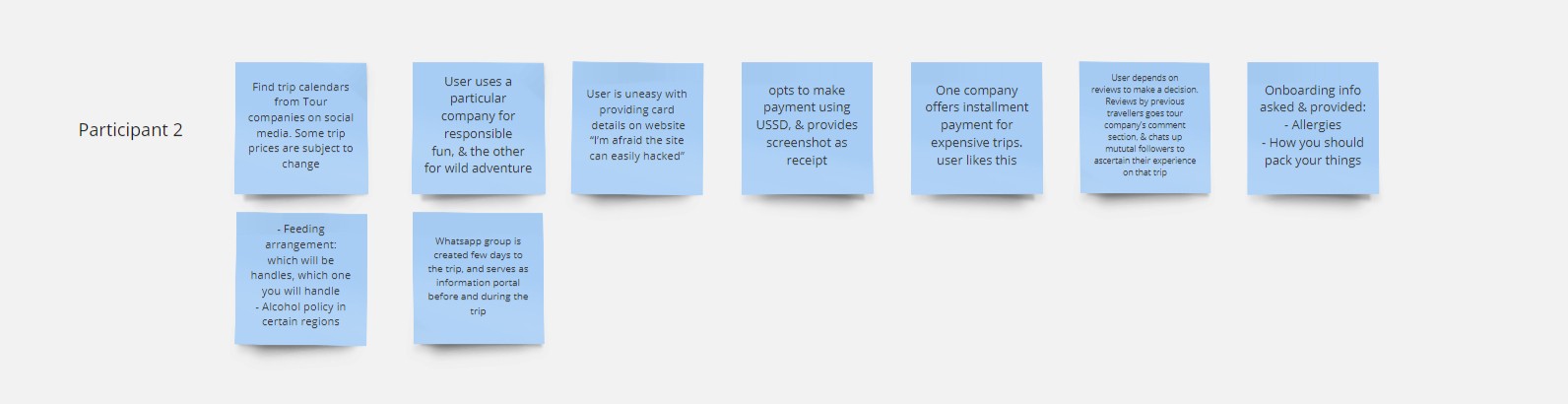
The findings from these Qualitative research data provided some insights which have opportunities to become product features. These were:
Product ease of use for the user means finding tour info quickly and fast site loading time
Seeing Images & Videos during Booking experience strengthens decision making
The amount of questions asked should be optimised so the user quickly gets to the booking confirmation stage
✅To scope my design problem, I defined my user group: Adult vacationers, & the core task flow: Find and Book trip
✅Using Calendly, I had volunteers who matched my screener questions schedule 30 minutes call time. In these user interviews, I learnt about their group trip experiences, and took notes of their behaviour, & needs through prepared research questions.
The findings from these Qualitative research data provided some insights which have opportunities to become product features. These were:
Product ease of use for the user means finding tour info quickly and fast site loading time
Seeing Images & Videos during Booking experience strengthens decision making
The amount of questions asked should be optimised so the user quickly gets to the booking confirmation stage

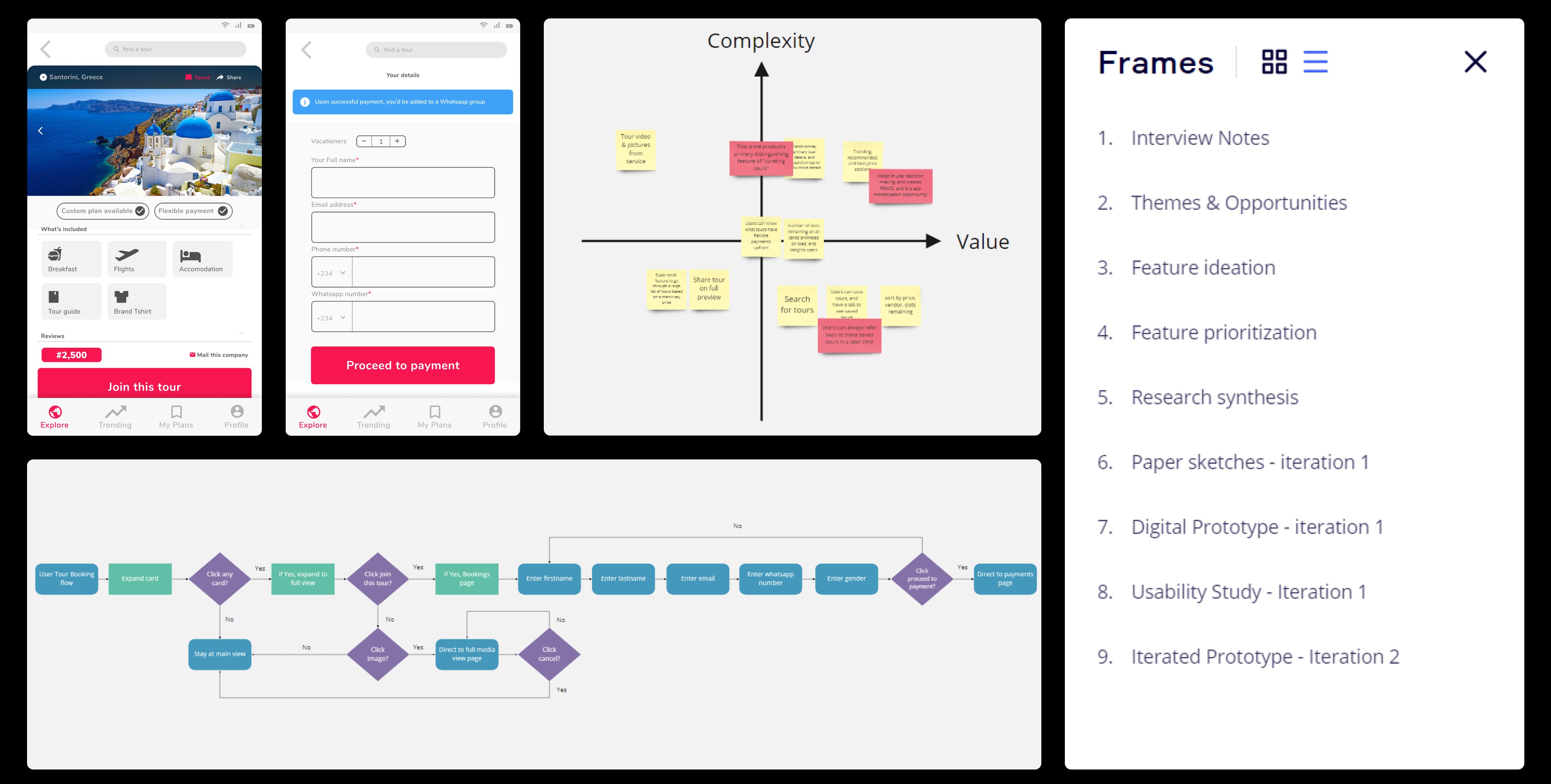
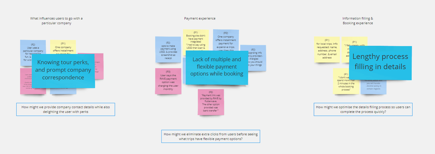
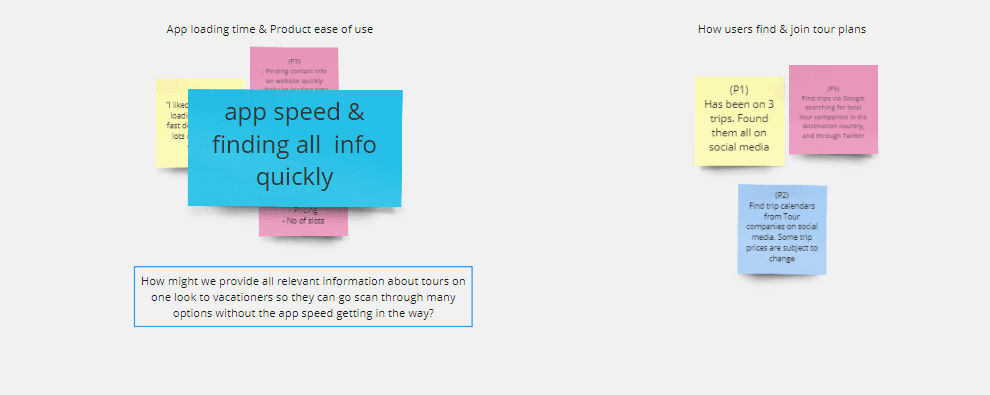
Design Sprint: affinity mapping
✅First off, I grouped similar & related data into themes, then I marked the themes that were good opportunities that I can solve for. I gave them concise problem statement names
✅Next, using the "How might we" question format, I reframed the problem statements into a pattern that mentions the pain point, and what user wants to achieve - inspiring but focused
✅ First off, I grouped similar & related data into themes, then I marked the themes that were good opportunities that I can solve for. I gave them concise problem statement names
✅ Next, using the "How might we" question format, I reframed the problem statements into a pattern that mentions the pain point, and what user wants to achieve - inspiring but focused
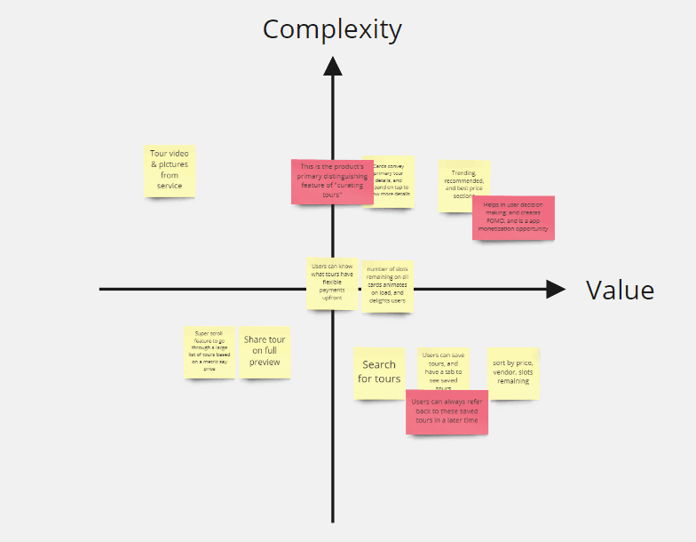
Design Sprint: feature ideation
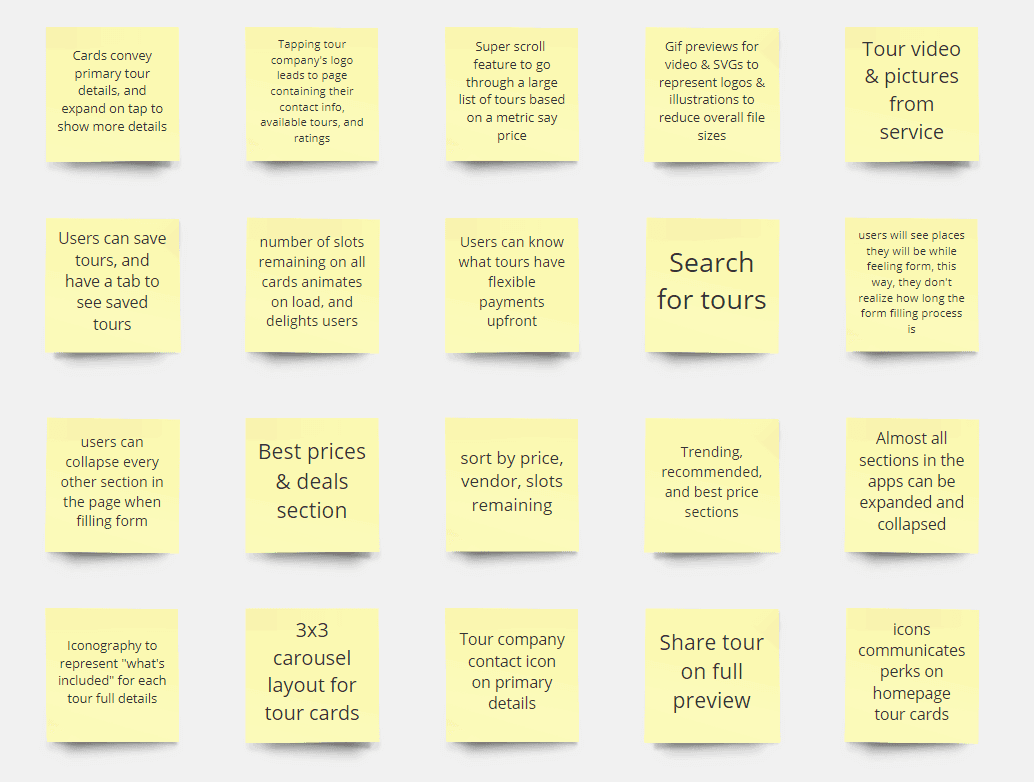
✅Next, using feature ideation techniques, I generated 20 ideas
✅I then placed them on the value-complexity quadrant. At this stage, selections for the feature solutions to be designed were made based on which features fell on the best point of interest on the quadrant
✅ Next, using feature ideation techniques, I generated 20 ideas
✅ I then placed them on the value-complexity quadrant. At this stage, selections for the feature solutions to be designed were made based on which features fell on the best point of interest on the quadrant
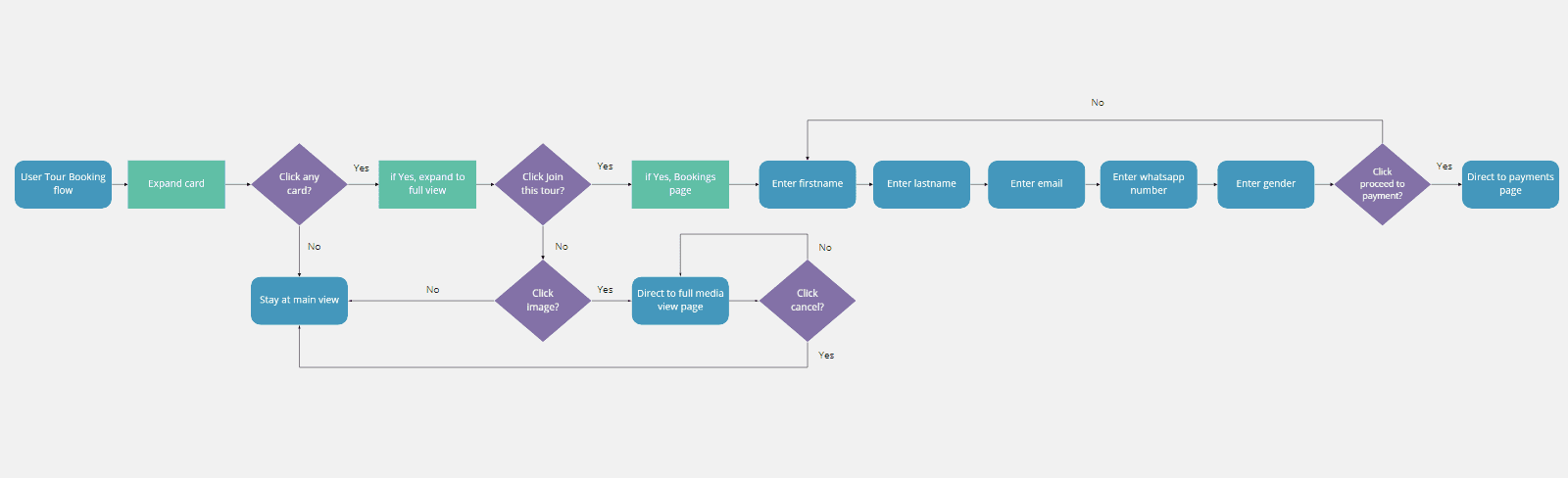
Design: userflow & sketches
✅ I broke down the core user task flow and feature solutions, then began making paper sketching and screen flows for what actions will lead to where. At every point I was returning to the user research to validate my actions.
✅ I broke down the core user task flow and feature solutions, then began making paper sketching and screen flows for what actions will lead to where. At every point I was returning to the user research to validate my actions.
✅ I broke down the core user task flow and feature solutions, then began making paper sketching and screen flows for what actions will lead to where. At every point I was returning to the user research to validate my actions.
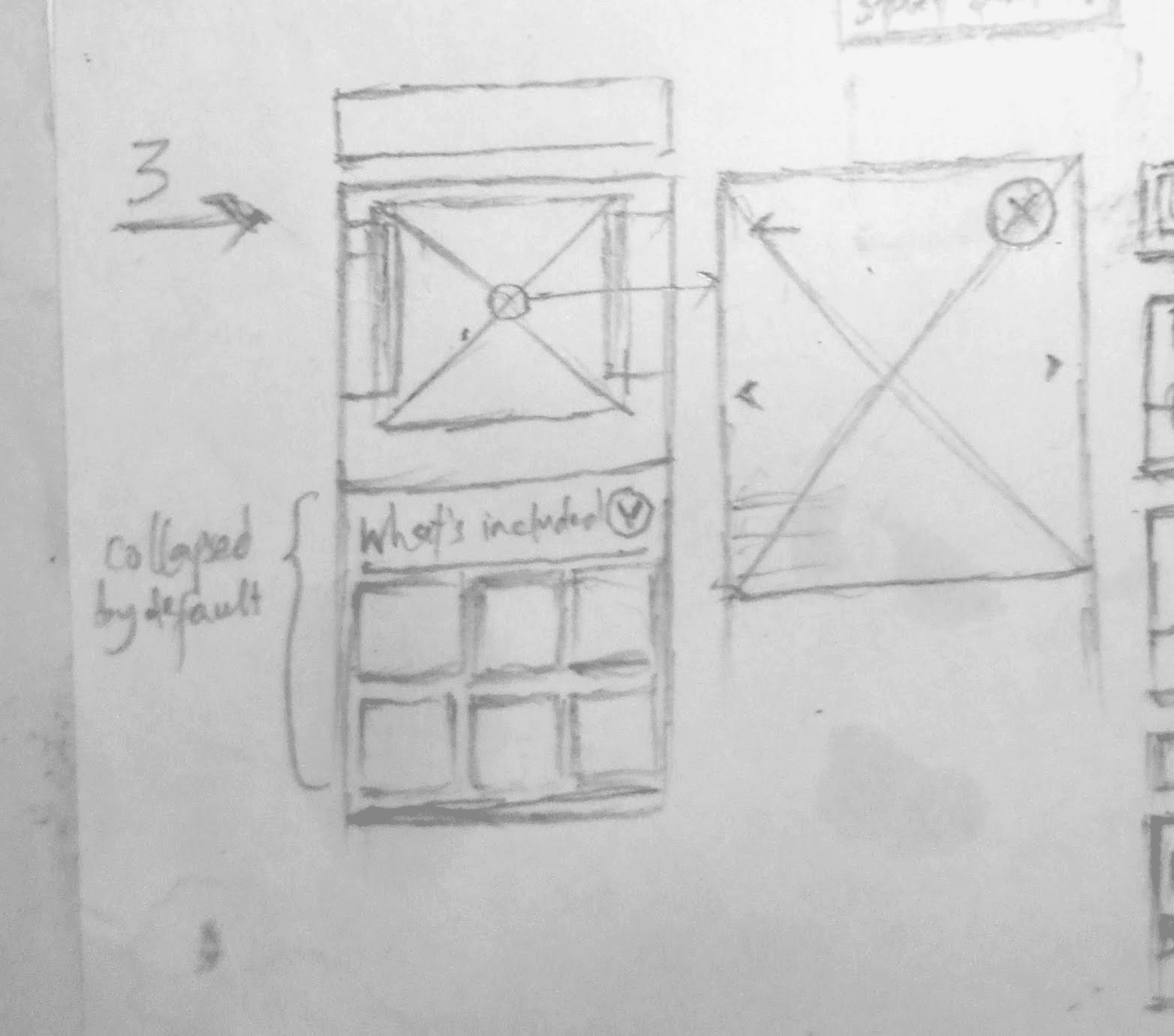
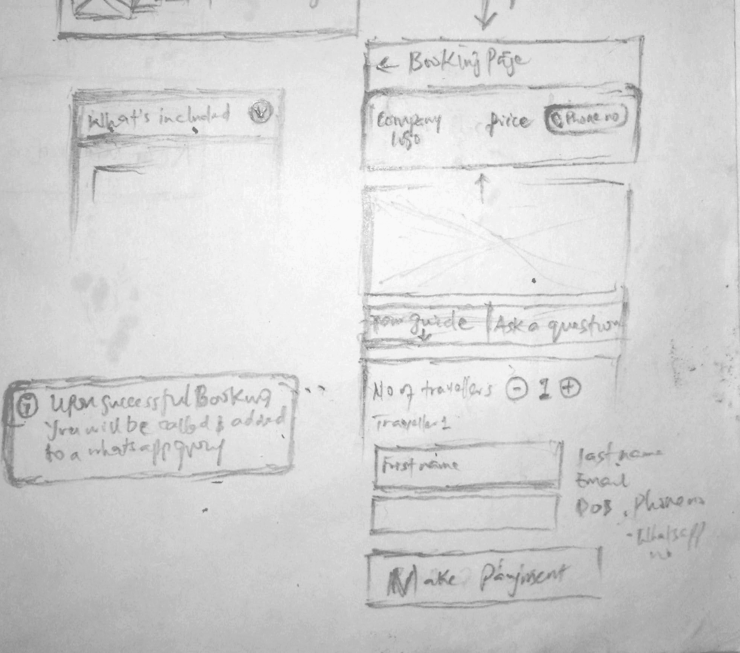
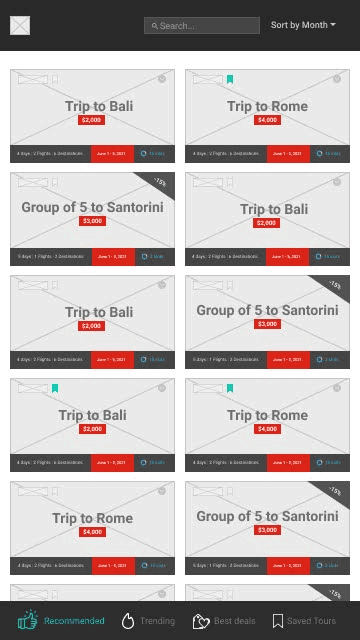
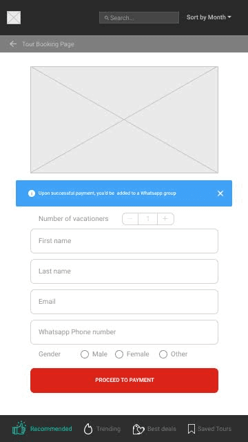
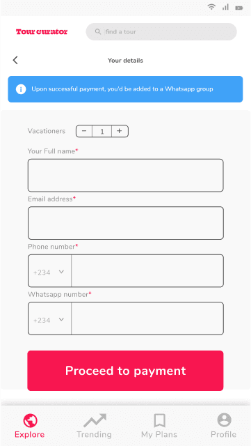
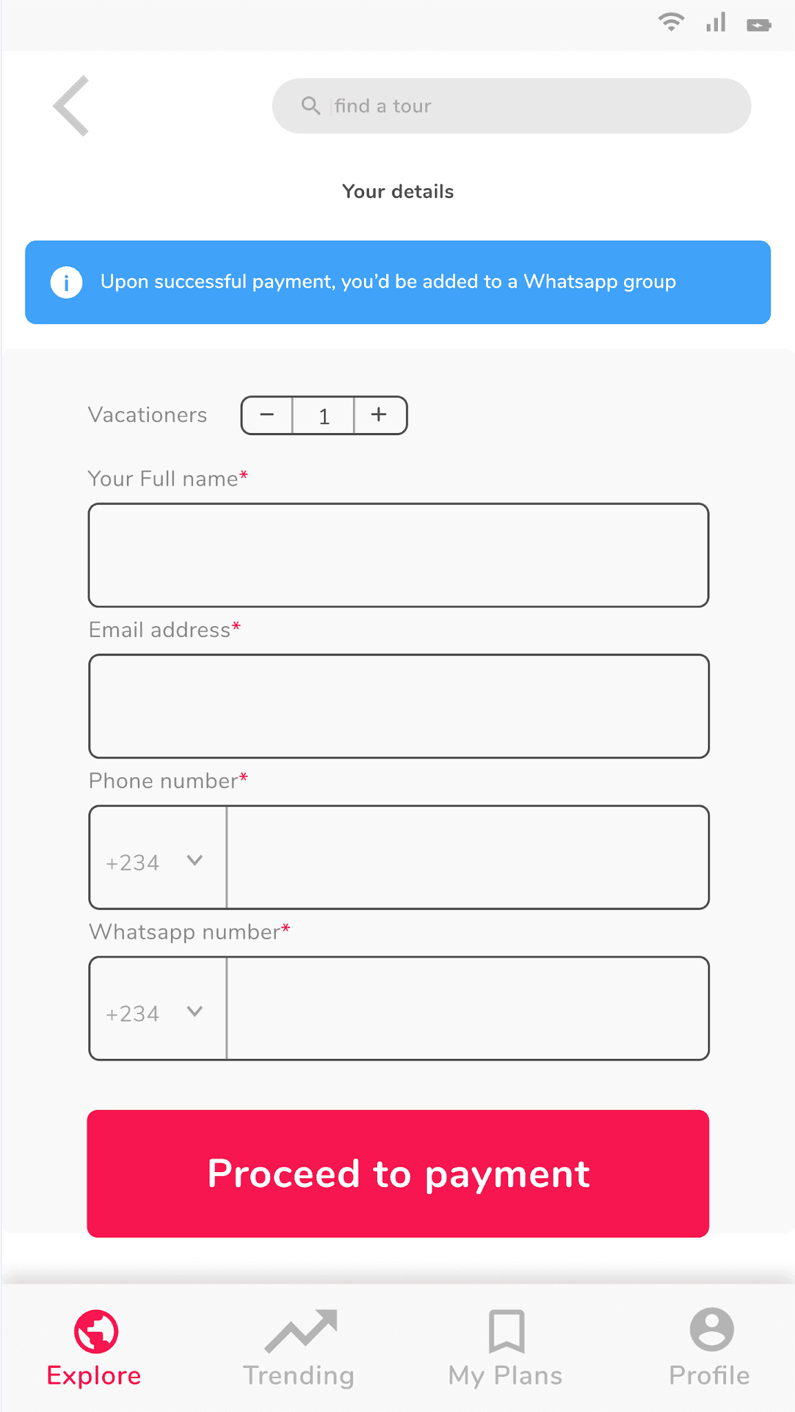
Design: wireframes
✅ These Wireframes are iterated artifacts after a Usability testing has been conducted on the first version.
This testing was conducted at this phase of the design so as to avoid the user’s “attractiveness bias”. A usability guide was used to conduct the sessions, and user behavior was observed, and adjustments were implemented.
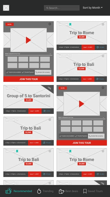
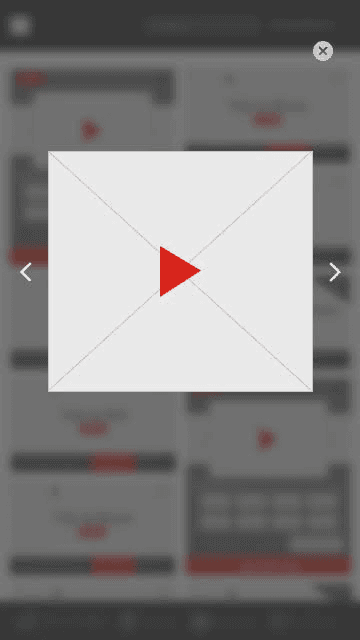
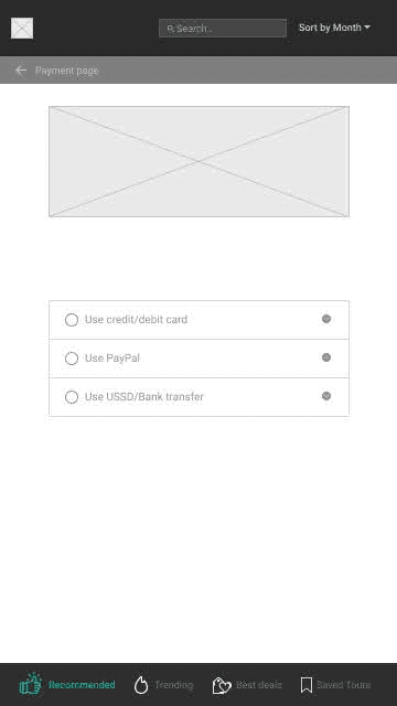
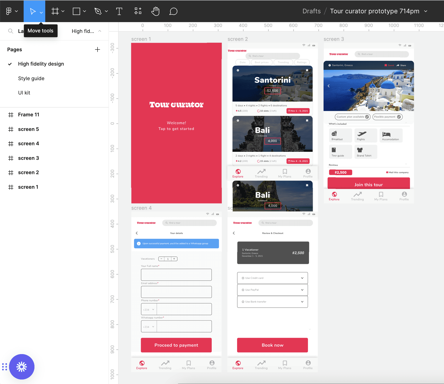
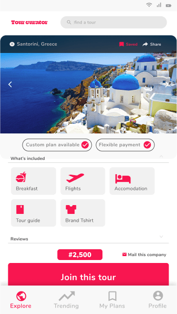
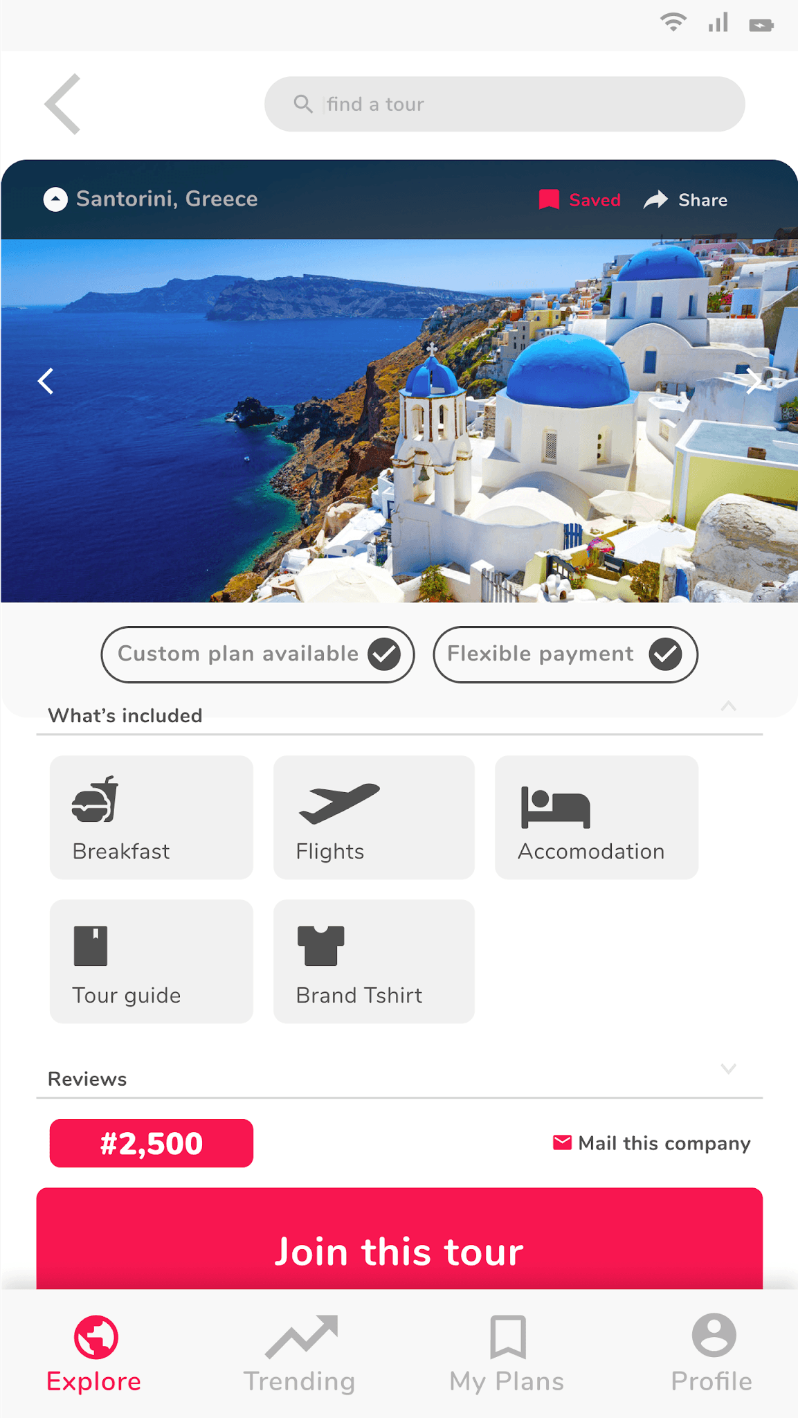
Design: prototyping
✅The designs of the screens for each step of the user flow. Material UI is the base theme used and I extended this by localizing the components, creating a custom UI kit & a style guide.
✅The designs of the screens for each step of the user flow. Material UI is the base theme used and I extended this by localizing the components, creating a custom UI kit & a style guide.
✅ The designs of the screens for each step of the user flow. Material UI is the base theme used and I extended this by localizing the components, creating a custom UI kit & a style guide.
Test: validation, usability, feedback
✅Using lookback.io, I conducted unmoderated remote Prototype testing with users. User feedback returned as audio, web/phone cam video, and app activity. In these sessions, users went through the usability task flows I had prewritten, and communicated their impressions & difficulties. I had 17 sign ups in total.
User Test Insights
All testers kept missing the collapse button to go back to explore page, and relied on tapping the logo/explore button
Testers were frustrated by their inability to use the back button in the details & checkout pages, resorting to using the logo/explore button which meant starting all over
70% of the users for a second struggled to read the "Mail this company" text due to it's small size
✅ Using lookback.io, I conducted unmoderated remote Prototype testing with users. User feedback returned as audio, web/phone cam video, and app activity. In these sessions, users went through the usability task flows I had prewritten, and communicated their impressions & difficulties. I had 17 sign ups in total.
User Test Insights
All testers kept missing the collapse button to go back to explore page, and relied on tapping the logo/explore button
Testers were frustrated by their inability to use the back button in the details & checkout pages, resorting to using the logo/explore button which meant starting all over
70% of the users for a second struggled to read the "Mail this company" text due to it's small size
Design: iteration
✅ A Data point from my Usability testing shows that that 80% of testers couldn’t use the back button
✅ A Data point from my Usability testing shows that that 80% of testers couldn’t use the back button
✅ A Data point from my Usability testing shows that that 80% of testers couldn’t use the back button
Solution & Impact overview
✅Reaching this as the final solution had me go through the entire breath of an immersive, and self sufficient product experience. Key activities involved recruiting, and interviewing users, deep research synthesis, learning Figma, and wiring up the first Wireframe, conducting usability testing to validate the lofi prototype,
Thanks to several usability testings, the initial problem statement is solved to a large extent.
✅ Reaching this as the final solution had me go through the entire breath of an immersive, and self sufficient product experience. Key activities involved recruiting, and interviewing users, deep research synthesis, learning Figma, and wiring up the first Wireframe, conducting usability testing to validate the lofi prototype,
Thanks to several usability testings, the initial problem statement is solved to a large extent.
© October 2025
© October 2025