Project overview
The first version of Transcend's admin dashboard was built and designed by engineers, so we had a number of usability issues that went unaddressed for some time until the product design team was built. The administration section of Transcend is where users are managed and invited on the platform, and the experience needed a facelift.
Role
Product designer
Duration
1½ month
What did I learn?
As this was my first Product design project, the process was very much of me absorbing and synthesizing existing knowledge.
First off, I spent some time studying the old design files. Doing this really helped, as it helped build a pattern recognition, as our design system wasn't fully matured
Converted low fi stakeholder decisions into functional prototypes while getting to apply Figma concepts like variants & translating them into hover states

How I solved these problems
We defined a new way of handling tables in Transcend, which maximizes horizontal and vertical space, as well as gives us the ability to use our new powerful filtering mechanisms.
Process
We wanted to maximize the amount of rows of users we could display on screen without sacrificing readability, and also make it easy to apply changes in bulk as well as filter this view with our powerful filtering mechanisms. We looked at other various tools that solved similar problems and found that a straightforward implementation was not hard to imagine.
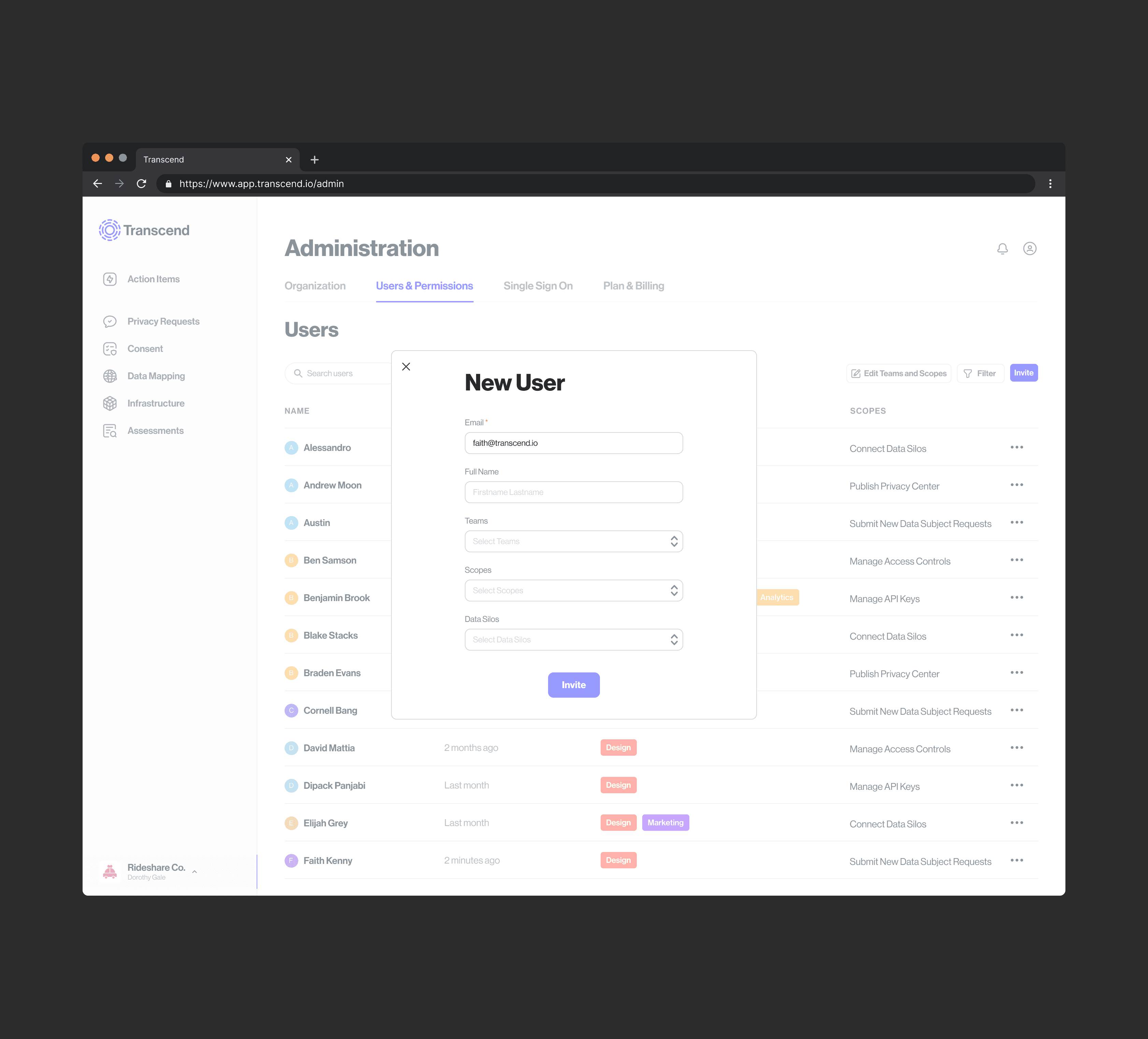
User journey map 1 - Admin/Accounts manager wants to add a new user
Invite sent, Pending screens
New user flow
Switch organizations, & Account settings
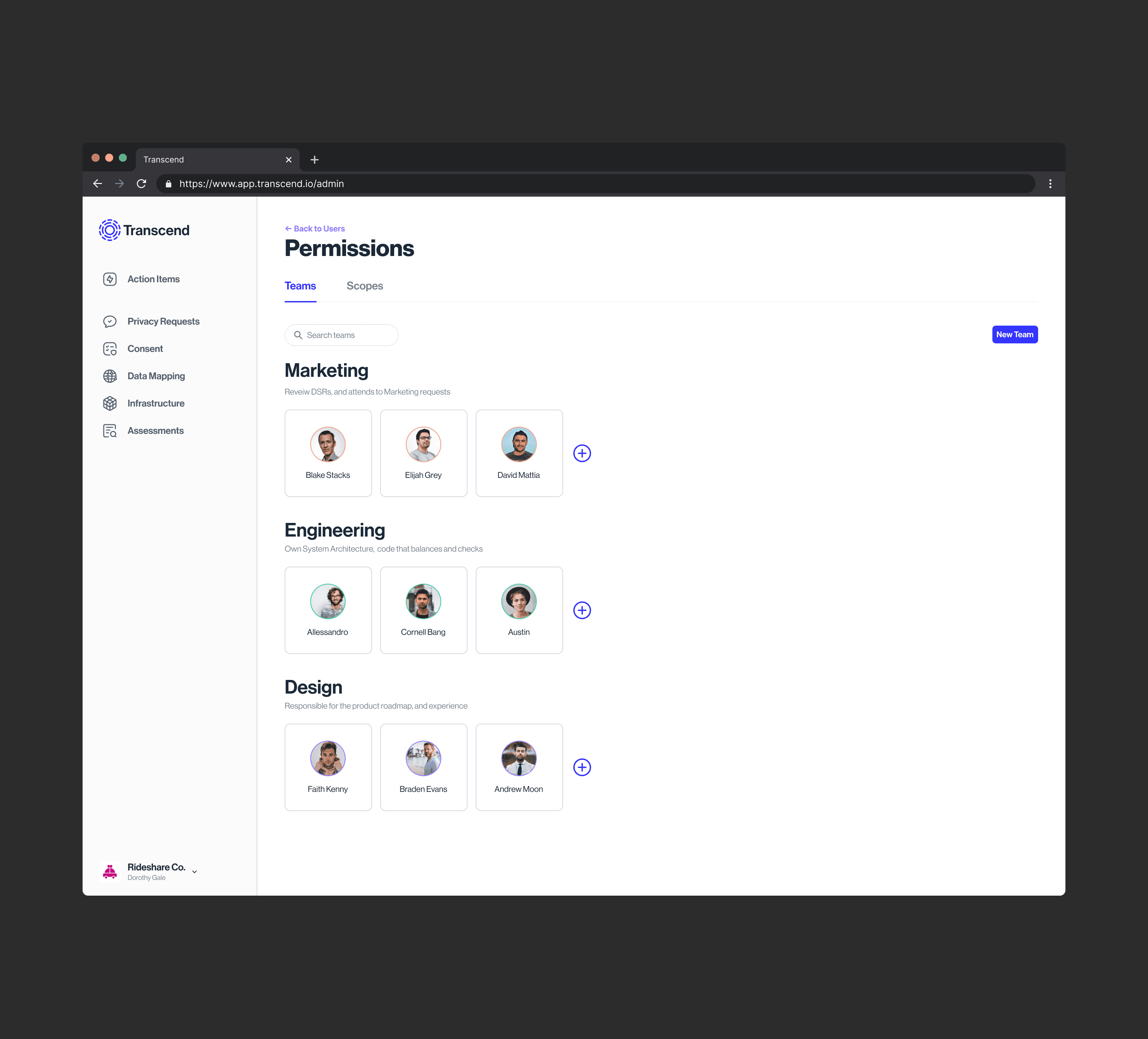
User journey map 2
Accounts manager wants to
Add new team
Edit existing team
Edit team scopes
User journey map 3
Administrator/Accounts manager needs access to
Switch organizations
Account profile settings
Organization profile settings, and Sign-on details
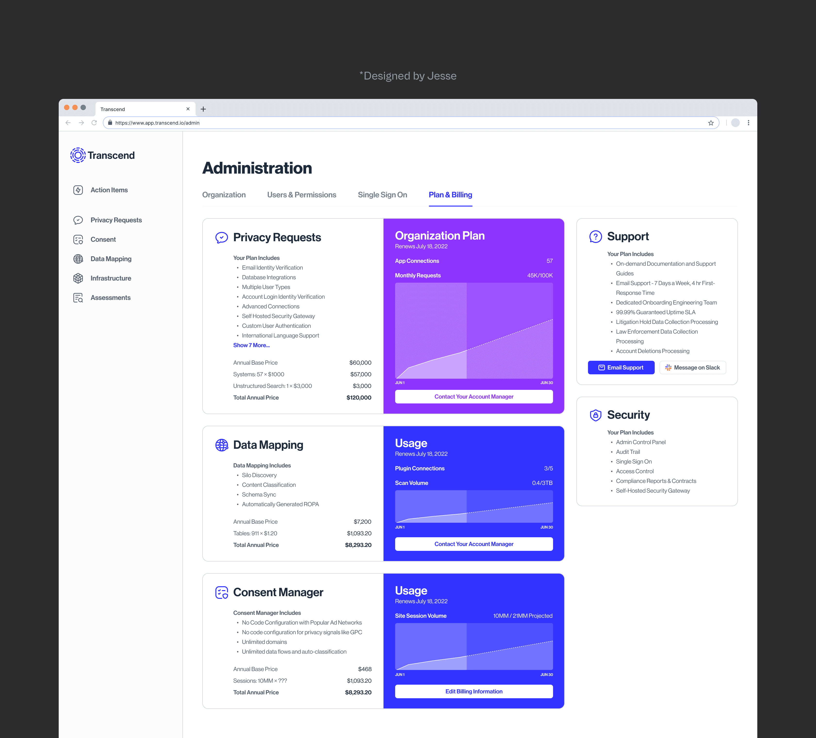
Plan & Billing tab - After/Before aggregated customers feedback
How the solutions performed
These design patterns were reused and adopted throughout the platform, and were able to help us lay a very solid foundation for many subsequent designs. It was a good exercise in creating design patterns that are reusable and test them on low-stakes functionality with users.
Migrate early from base component model of building design patterns to using variants. the latter prevents endless nestings, is a better alternative to the previously clunky way Figma handled states and in overall buys time
Asides this, nothing. I was off to a good start.
© October 2025


